- Absence
- Angular
- Breadcrumb
- Buzz
- Custom HTML
- EvoCalendar
- Grid
- Intel Chart
- Power Bi Chart
- Layout Formatter
- Progress Indicator
- Progression
- Register Review
- Search
- SMS
- Standard
- Tab
- Validation
A page will typically have a number of controls. A typical minimum configuration would be:
- A data formatter, providing a page header section
- A data grid or data formatter containing the main data for the page
When configuring controls in Ontrack Designer, you can:
To add a control to a page:
-
Select the page you want to add the control to from the Page Details section of the screen.
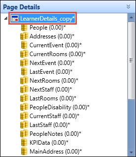
-
Select the Add Control button and select the required control on the System Configuration Commands ribbon.
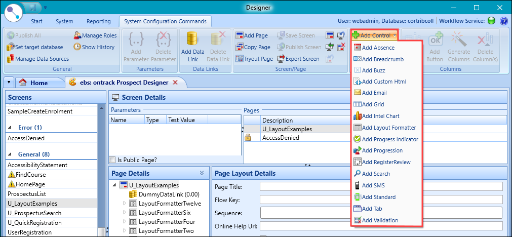
The control will be added to the page and will automatically be selected.
-
Enter the details of the control in the Control Details section.
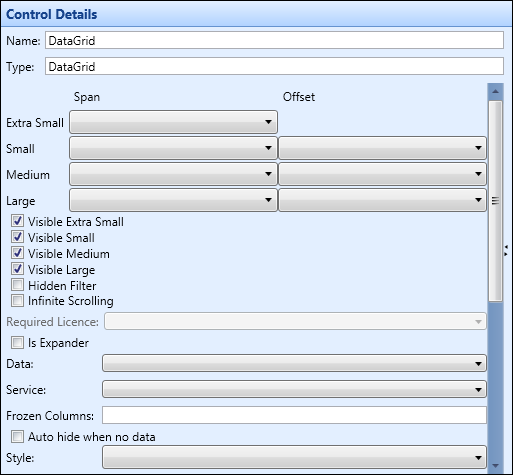
The generic fields that apply to all control types are described in the following table.
| This field | Holds this information... |
|---|---|
| Name | The name of the control. The recommended naming convention for controls is to use title case with no spaces, based on the data link that will supply data to the control and any additional text to identify the control. For example: PeopleDetails. |
| Type | The type of control. |
| Span and Offset |
Where the control sits on the different screen sizes. Select from one to twelve for Span and one to eleven for offset. Important.There is no offset for Extra small as there is no space to use.
|
| Style | The visual style that will be applied to the control. |
| Data | The data link or control that will supply data to the control. This will usually be a data link but can also be another control when the two controls are linked in a parent/child configuration. |
-
Select Save .
The selected control is added.
The Absence control is used to add the ability to record an absence. To add an absence control, select the Add Control button and select the Add Absence option on the System Configuration Commands ribbon.
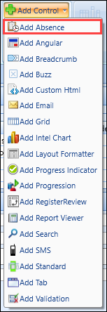
You can enter the details of the Absence control in the Control Details section.
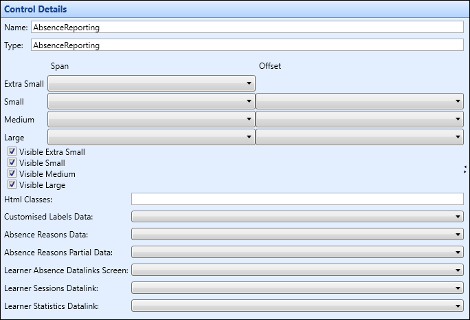
The fields for the absence control are described in the following table.
| This field | Holds this information... |
|---|---|
| Name | The name of the control. |
| Type | The type of control. |
| Span and Offset |
Where the control sits on the different screen sizes. Select from one to twelve for span and one to eleven for offset. Important.There is no offset for Extra Small as there is no space to use.
|
| Visible Extra Small | Whether the control will display when viewed on an extra small phone. |
| Visible Small | Whether the control will display when viewed on a phone. |
| Visible Medium | Whether the control will display when viewed on a tablet. |
| Visible Large | Whether the control will display when viewed on a PC. |
| Html Classes |
The HTML classes to use so you can apply your own CSS styles to elements and display an institution-specific theme. Important.Multiple styles can be applied by adding a space between them (for example: alignleft smallfont).
|
| Customised Labels Data | A datalink that returns all the customisable text for the absence reporting wizard from the Absence Reporting Wizard Labels reference data. |
| Absence Reasons Data | A datalink that returns absence reasons from the Absence Reasons reference data. |
| Absence Reasons Partial Data | A datalink that returns absence reasons from the Absence Reasons reference data where the linked Register Usage Code is marked as 'Partial'. |
| Learner Absence Datalinks Screen | Holds the Learner Sessions and Learner Statistics datalinks with input parameters of Start Date, Start Time, End Date, End Time and Absence Reason Code. These datalinks are called by the Report Absence Wizard to dynamically populate data on the screen as the user navigates through the wizard. |
| Learner Sessions Datalink | A datalink for when a learner enters an absence for a single day on the first step of the wizard and is prompted to enter whether they want to be absent for the full day or a part day. Their sessions are also displayed for the day that they want to report the absence. |
| Learner Statistics Datalink | A datalink for displaying the learner’s current attendance and punctuality in the graph panel of the absence reporting confirmation screen. The impact of the attendance is also output, displaying the learner’s attendance after reported absence. |
The ConfirmationPageText and NoEvidenceText columns are also added when an Absence control is added.
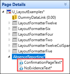
The additional fields on the Column Details section for these columns are described in the following table.
| This field | Holds this information... |
|---|---|
| Required Licence | This field is not applicable. |
| Is Expander |
Whether the control can be expanded. This is displayed with an expander button.
|
| Expander header |
The header to display if the control is configured as an expandable section. Important.This is only enabled when the Is Expander check box is selected.
|
| Html | The HTML code that will be embedded into the page. |
The Angular control is used to create pages with the Angular framework.
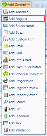
To add an Angular control, select the Add Control button and select the Add Angular option on the System Configuration Commands ribbon.
You can enter the details of the angular control in the Control Details section.
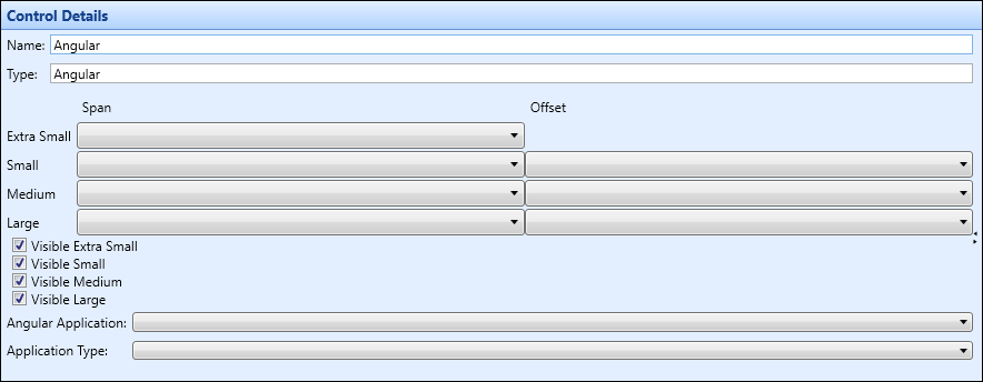
The fields for the angular control are described in the following table.
| This field | Holds this information... |
|---|---|
| Name | The name of the control. |
| Type | The type of control. |
| Span and Offset |
Where the control sits on the different screen sizes. Select from one to twelve for span and one to eleven for offset. Important.There is no offset for Extra Small as there is no space to use.
|
| Visible Extra Small | Whether the control will display when viewed on an extra small phone. |
| Visible Small | Whether the control will display when viewed on a phone. |
| Visible Medium | Whether the control will display when viewed on a tablet. |
| Visible Large | Whether the control will display when viewed on a PC. |
| Angular Application | Whether the application is ILP User Management, ILP Tutor or ILP Learner. |
| Application Type | Whether the application type is full page or panel. |
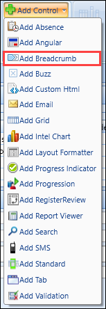
The breadcrumb control is used to add breadcrumb links to pages and show progress through a set of pages in a configurable visual way. The control is data-driven, so can have any number of pages. To add a breadcrumb control, select the Add Control button and select the Add Breadcrumb option on the System Configuration Commands ribbon.
Each step that is added to the breadcrumb control can be static, or a dynamic link to another page. This allows you to control navigation (for example: allow users to navigate to pages that they have already visited, but prevent navigation to pages further along in the wizard until they have completed the current page).
You can enter the details of the breadcrumb control in the Control Details section.
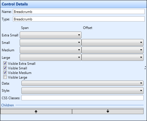
The fields for the breadcrumb control are described in the following table.
| This field | Holds this information... |
|---|---|
| Name | The name of the control. |
| Type | The type of control. |
| Span and Offset |
Where the control sits on the different screen sizes. Select from one to twelve for span and one to eleven for offset. Important.There is no offset for Extra Small as there is no space to use.
|
| Visible Extra Small | Whether the control will display when viewed on an extra small phone. |
| Visible Small | Whether the control will display when viewed on a phone. |
| Visible Medium | Whether the control will display when viewed on a tablet. |
| Visible Large | Whether the control will display when viewed on a PC. |
| Data | A selection of data links or control to associate the current control with. This enables you to add columns to the control from a data link. |
| Style | The CSS style to be used for this control. |
| CSS Classes | The CSS classes to be used for this control. |
| Children | The associated columns for the controls. |
You can add a column to the breadcrumb control and configure various aspects relating to the breadcrumb links in the following fields:
-
Display Text - controls the text shown on the breadcrumb step, and also sets the tooltip on the associated image
- Image Path - use to add an optional image (for example: Images/user16.png), which is included in a path relative to the root of the website
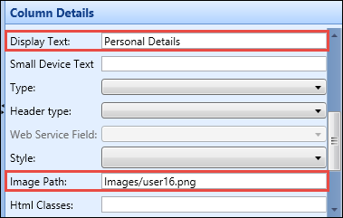
When the required details have been entered and the changes saved, the breadcrumb links will be displayed on the page.

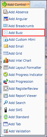
The Buzz control can be configured to send Engage messages to a single user or a group of users (that is: learners or members of staff/anyone with a person code). To add a Buzz control, select the Add Control button and select the Add Buzz option on the System Configuration Commands ribbon.
You can enter the details of the Buzz control in the Control Details section.
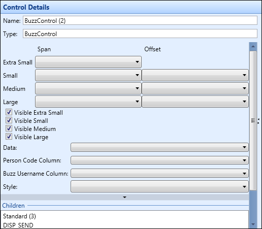
The fields for the Buzz control are described in the following table.
| This field | Holds this information... |
|---|---|
| Name | The name of the control. |
| Type | The type of control. |
| Span and Offset |
Where the control sits on the different screen sizes. Select from one to twelve for span and one to eleven for offset. Important.There is no offset for Extra Small as there is no space to use.
|
| Visible Extra Small | Whether the control will display when viewed on an extra small phone. |
| Visible Small | Whether the control will display when viewed on a phone. |
| Visible Medium | Whether the control will display when viewed on a tablet. |
| Visible Large | Whether the control will display when viewed on a PC. |
| Data |
A selection of data links or control to associate the current control with. This enables you to add columns to the control from a data link. When configuring for a single learner, set to an appropriate data link containing the Engage username and person code. When wanting to send SMS messages to a number of learners, set to a grid control. |
| Is Selected Column |
Set this field to ensure that Engage messages are only sent to learners in the grid where the Boolean column is ticked. Important.This field is only displayed when a grid control is selected in the Data field.
|
| Person Code Column |
The person code column for this control. Important.This will be the same as the Engage username column in a standard implementation.
|
| Buzz Username Column |
The Engage username column for this control. Important.This will be the same as the person code column in a standard implementation.
|
| Style | The CSS style to be used for this control. |
| Children | The associated columns for the controls. |
| Sequence Number | The sequence this column occupies in a cell (column and row) if more than one control is specified for this column and row value. |
Adding a Buzz control will also create a number of standard controls that allow you to configure various aspects of the design.
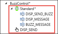
The BuzzStandard contains the minimum necessary populated fields to send an Engage message. All fields can be pre-populated on page load, either from static or dynamic text from a data link (for example: Engage text might be pre-populated as 'Hi Michael'). The following can also be configured:
- DISP_SEND_BUZZ - the control title which can be static or driven from a data link
- DISP_MESSAGE and BUZZ_MESSAGE - the Engage message and label
- DISP_SEND - the send button text which can be configured
When the required details have been entered and the changes saved, the Send Message section (accessed from the Engage tab) will be displayed on the page so you can send Engage messages to learners.

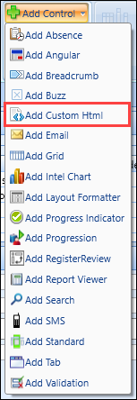
The custom HTML control enables you to add, or amend existing, raw HTML to pages. To add a custom HTML control, select the Add Control button and select the Add Custom HTML option on the System Configuration Commands ribbon.
You can enter the details of the custom HTML control in the Control Details section.
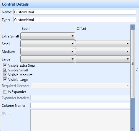
The fields for the custom HTML control are described in the following table.
| This field | Holds this information... |
|---|---|
| Name | The name of the control. |
| Type | The type of control. |
| Span and Offset |
Where the control sits on the different screen sizes. Select from one to twelve for span and one to eleven for offset. Important.There is no offset for Extra small as there is no space to use.
|
| Visible Extra Small | Whether the control will display when viewed on an extra small phone. |
| Visible Small | Whether the control will display when viewed on a phone. |
| Visible Medium | Whether the control will display when viewed on a tablet. |
| Visible Large | Whether the control will display when viewed on a PC. |
| Is Expander |
Whether the control can be expanded. This is displayed with an expander button.
|
| Expander Header | The name of the expander. |
| HTML |
The HTML code that will be embedded into the page. Important.In the custom HTML control, use {[FieldName]} to embed data.
|
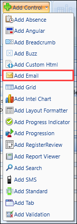
The email control can be configured to send emails to a single user or a group of users (that is: learners or members of staff/anyone with a person code). To add an email control, select the Add Control button and select the Add Email option on the System Configuration Commands ribbon.
You can enter the details of the email control in the Control Details section.
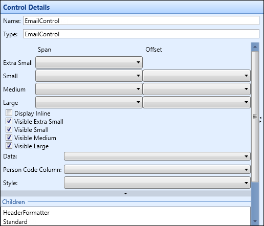
The fields for the email control are described in the following table.
| This field | Holds this information... |
|---|---|
| Name | The name of the control. |
| Type | The type of control. |
| Span and Offset |
Where the control sits on the different screen sizes. Select from one to twelve for span and one to eleven for offset. Important.There is no offset for Extra Small as there is no space to use.
|
| Display Inline | Sets whether all the columns for the control are next to each other. |
| Visible Extra Small | Whether the control will display when viewed on an extra small phone. |
| Visible Small | Whether the control will display when viewed on a phone. |
| Visible Medium | Whether the control will display when viewed on a tablet. |
| Visible Large | Whether the control will display when viewed on a PC. |
| Data |
A selection of data links or control to associate the current control with. This enables you to add columns to the control from a data link. When configuring for a single learner, set to an appropriate data link containing the email address and person code. When wanting to send emails to a number of learners, set to a grid control. |
| Is Selected Column |
Set this field to ensure that emails are only sent to learners in the grid where the Boolean column is ticked. Important.This field is only displayed when a grid control is selected in the Data field.
|
| Person Code Column | The person code column for this control, which should be set to PERSON_CODE. |
| Style | The CSS style to be used for this control. |
| Children | The associated columns for the controls. |
| Sequence Number | The sequence this column occupies in a cell (column and row) if more than one control is specified for this column and row value. |
Adding an email control will also create a number of standard controls that allow you to configure various aspects of the design.
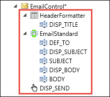
The HeaderFormatter controls the displayed title (for example: Send Email). This may be data-driven.
The EmailStandard contains the minimum necessary populated fields to send an email. All fields can be pre-populated on page load, either from static or dynamic text from a data link (for example: email subject might be pre-populated as 'Regarding course application for Michael Hogan'). The following can also be configured:
- DEF_TO - the recipient email address which can be hidden if populated from a data link
- DISP_SUBJECT and SUBJECT - the email subject label and text box
- DISP_BODY and BODY - the email body label and text box
-
DISP_SEND - the send button text which can be configured
Important.The Lockdown column on this control can be used to determine whether or not the button is enabled (for example: disable if the learner does not have an email address, or has asked not to be contacted by email).
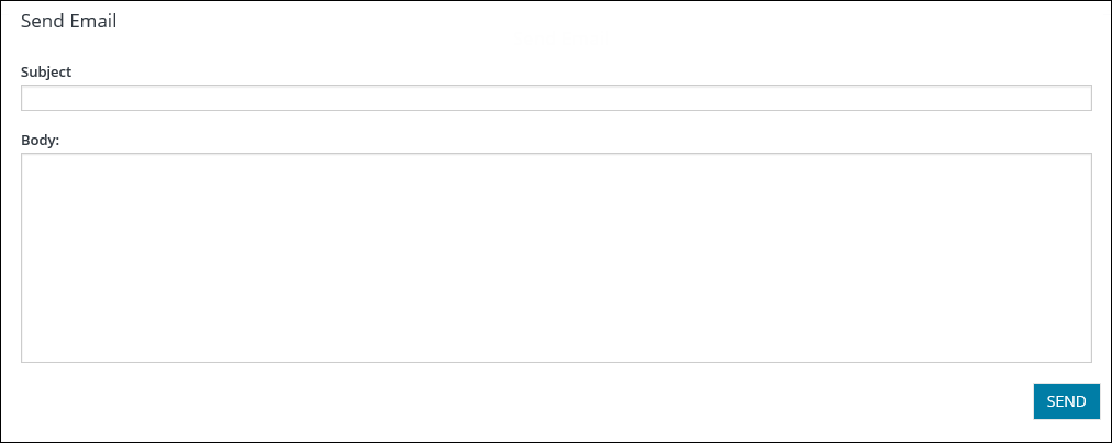
When the required details have been entered and the changes saved, the Send Email section will be displayed on the page so you can send emails to learners.
The evo calendar control can be configured to display an interactive calendar. The control takes events from shape and displays . You can control if an event is shown on this calendar using the Event Type reference data. The colour of the icons shown is also taken from the same place.

You can enter the details of the evoCalendar control in the Control Details section.
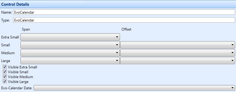
The fields for the EvoCalendar control are described in the following table.
| This field | Holds this information... |
|---|---|
| Name | The name of the control. |
| Type | The type of control. |
| Span and Offset |
Where the control sits on the different screen sizes. Select from one to twelve for span and one to eleven for offset. Important.There is no offset for Extra Small as there is no space to use.
|
| Visible Extra Small | Whether the control will display when viewed on an extra small phone. |
| Visible Small | Whether the control will display when viewed on a phone. |
| Visible Medium | Whether the control will display when viewed on a tablet. |
| Visible Large | Whether the control will display when viewed on a PC. |
| Evo-Calendar Data |
A selection of data links to source the data for the calendar events. |
The grid control is used to display tabular data. To add a grid control, select the Add Control button and select the Add Grid option on the System Configuration Commands ribbon.
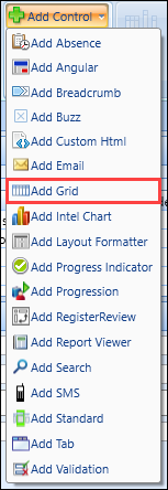
The following restrictions apply in Ontrack Designer when configuring grids to ensure data can be displayed correctly on pages:
- Grids cannot be added to layout formatters if that layout formatter (or a parent/grandparent and so on) have a data link associated with it
- If a layout formatter or any descendant of it contains a grid then it cannot have a data link associated with it
You can enter the details of the grid control in the Control Details section.
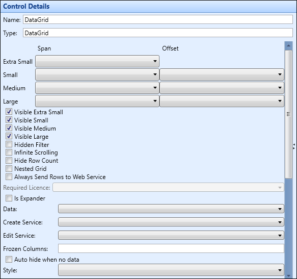
The fields for the grid control are described in the following table.
| This field | Holds this information... |
|---|---|
| Name | The name of the control. |
| Type | The type of control. |
| Span and Offset |
Where the control sits on the different screen sizes. Select from one to twelve for span and one to eleven for offset. Important.There is no offset for Extra Small as there is no space to use.
|
| Visible Extra Small | Whether the control will display when viewed on an extra small phone. |
| Visible Small | Whether the control will display when viewed on a phone. |
| Visible Medium | Whether the control will display when viewed on a tablet. |
| Visible Large | Whether the control will display when viewed on a PC. |
| Hidden Filter | Hides the filter for the grid. |
| Infinite Scrolling | Enables infinite scrolling and removes page functionality when viewing data in a grid. |
| Hide Row Count | Hides the count of the number of rows. |
| Nested Grid | Nests the grid inside another. |
| Always Send to Web Service | Whether to force data to the web service as part of the write-back process. |
| Required Licence |
This field is not applicable. |
| Is Expander |
Whether the control can be expanded. This is displayed with an expander button.
|
| Data | A selection of data links or control to associate the current control with. This enables you to add columns to the control from a data link. |
| Create Service | Create the REST service to use for configurable write-back. Important.This field is controlled by the OntrackWriteback licence. If the licence is not enabled, the Service field is greyed out. |
| Edit Service | Edit the REST service to use for configurable write-back. Important. Use of the Edit Service field is currently restricted to the selection of UI/UIO Assessment services for the new Manage Assessment page where Create UI/UIO Assessment and Update UI/UIO Assessment services can be selected from either or both Create Service or Edit Service drop-down fields. This functionality will be extended to additional services in future releases. |
| Frozen Columns | Which columns on the grid are frozen when scrolling from left to right on a grid. |
| Auto hide when no data | If set, no grid will display if no data has been returned from a search. |
| Style | The CSS style to be used for this control. |
| Page Size | Max amount of records displayed on a grid. |
| Display Add/Remove | If set, add and remove options are enabled:
|
| Display Add/Remove by | Display add or remove by permission. |
| Row Remove Service | The delete service. |
| Display Remove Warning Confirmation | If set, the Remove Warning Message field is enabled. |
| Remove Warning Message | The warning message text. |
| Validate row on Add | Whether to validate when a row is added to the grid. |
| Display export to CSV | Whether the option to export to CSV displays on the page of the grid. |
| Display export to Excel | Whether the option to export to Excel displays on the page of the grid. |
| Display export to Word | Whether the option to export to Word displays on the page of the grid. |
| Display export to PDF | Whether the option to export to PDF displays on the page of the grid. |
There is a further section under these fields that displays the Column Details.

The fields for column details are described in the following table.
| This field | Holds this information... |
|---|---|
| Children | The names of the columns associated with the grid. |
| Sequence Number | The sequence this column occupies in a cell (column and row) if more than one control is specified for this column and row value. |
The Row Details section enables you to add further information to rows on a grid. This is expanded by selecting the arrow button on the left hand side of the row, which will then expand to display the additional information.

To enable row details for a grid:
-
Select the Add Control button and select the Add Standard option on the System Configuration Commands ribbon.
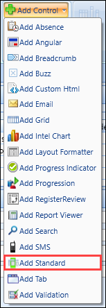
-
Select the data link the row will generate it's values from by selecting from the Data drop-down field.
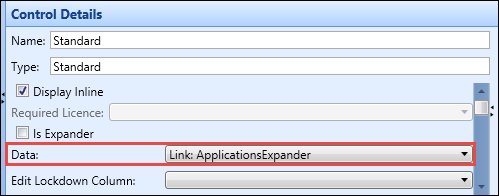
-
Select the Generate Columns button on the System Configuration Commands ribbon to add all columns associated with the data link.
 Important.You can remove any columns you do not want to view in the row details by selecting the column under the standard control and selecting the Delete Column(s) button.
-
Return to the grid you have created and scroll down to the Row Details section and select the Standard control from the drop-down list.
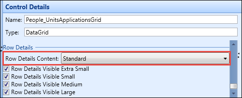
-
Select which size screens will use the row details functionality by selecting the relevant check box.
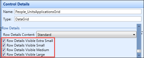
-
Select Save .
The row details are saved.
The intel chart control is used to embed BI charts on pages. If included on a page that is browsed to by a user that does not have access to the BI chart, the chart will be collapsed and hidden. To add an intel chart control, select the Add Control button and select the Add Intel Chart option on the System Configuration Commands ribbon.

You can enter the details of the intel chart control in the Control Details section.
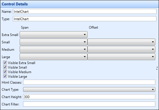
The fields for the intel chart control are described in the following table.
| This field | Holds this information... |
|---|---|
| Name | The name of the control. |
| Type | The type of control. |
| Span and Offset |
Where the control sits on the different screen sizes. Select from one to twelve for span and one to eleven for offset. Important.There is no offset for Extra Small as there is no space to use.
|
| Visible Extra Small | Whether the control will display when viewed on an extra small phone. |
| Visible Small | Whether the control will display when viewed on a phone. |
| Visible Medium | Whether the control will display when viewed on a tablet. |
| Visible Large | Whether the control will display when viewed on a PC. |
| HTML Classes |
The HTML classes to use so you can apply your own CSS styles to elements and display an institution-specific theme. Important.Multiple styles can be applied by adding a space between them (for example: alignleft smallfont).
|
| Chart Type | The chart type to use. Select from the drop-down list. |
| Chart Height |
The chart height (in pixels). This is set to 300px by default. Important.The control layout will wrap within the responsive framework and the control will resize to fit the screen size in use.
|
| Chart Filter |
The filter to apply to a chart URL (for example: /chart-filter-params=[[Course Occurrence]]{{1819}} filters the chart to only show data where course occurrence = 1819). The filter to apply to a chart URL. The following list provides examples of filters that can be applied:
You can also use the following delimiters:
The following examples display how the filters and delimiters can be used:
|
When the required details have been entered and the changes saved, the BI charts will be displayed on the page.
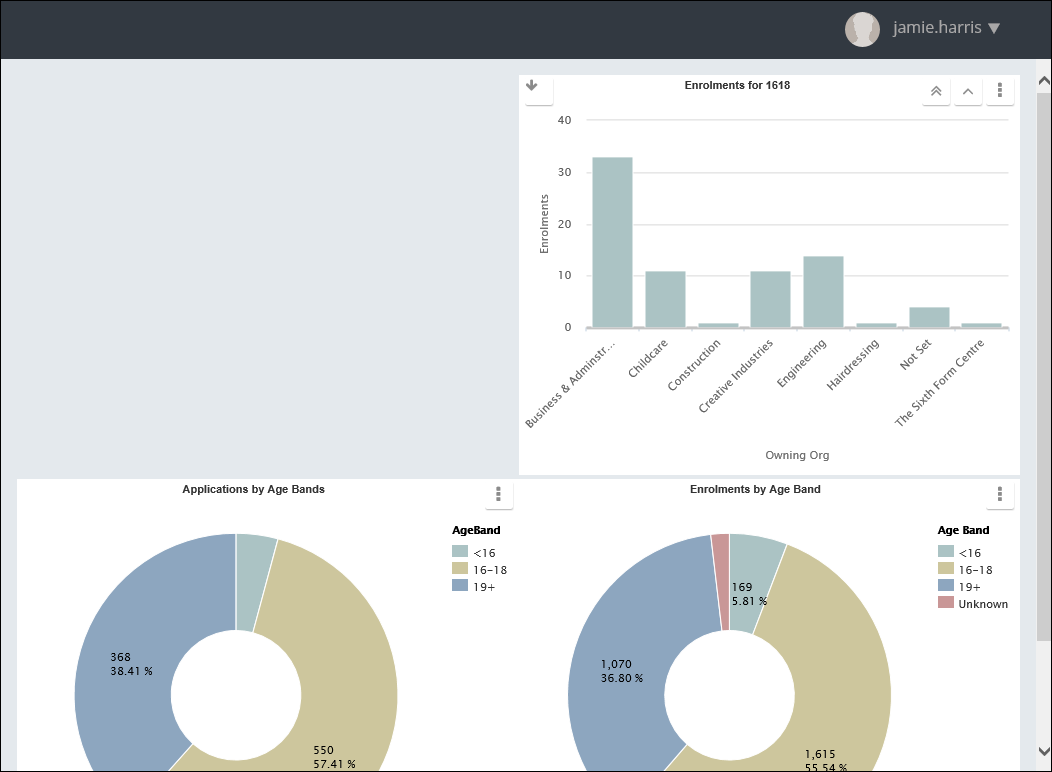
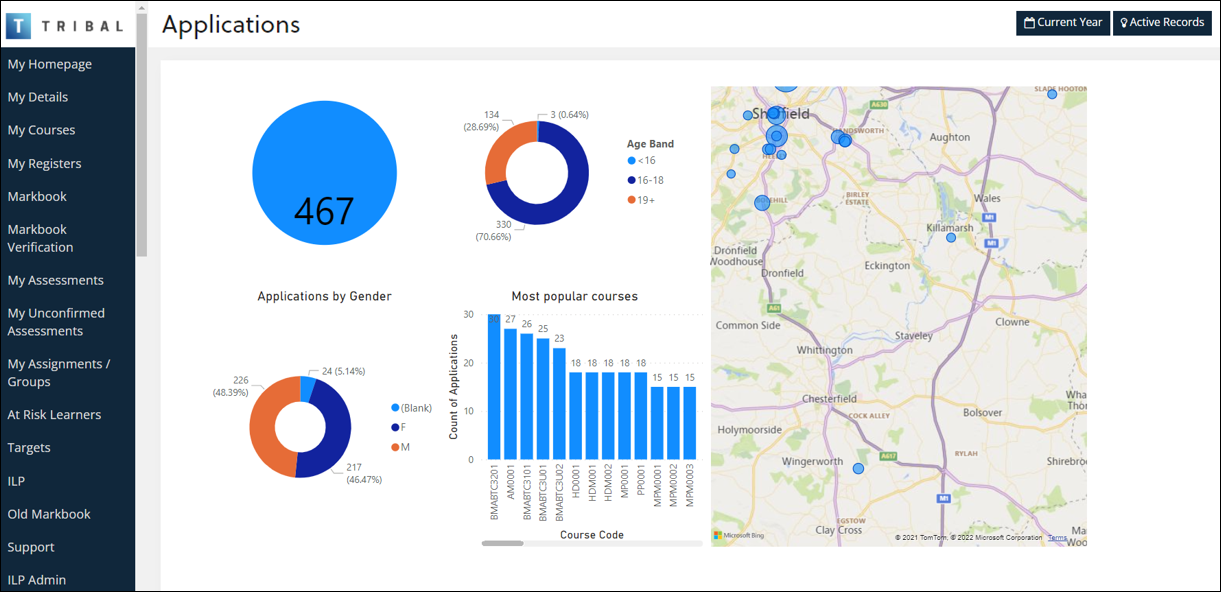
The Power Bi chart control is used to embed Power BI dashboards and charts in EBS Ontrack. To add a Power BI chart control, select the Add Control button and select the Add Power Bi Chart option on the System Configuration Commands ribbon.

You can enter the details of the Power Bi chart control in the Control Details section.
![]()
The fields for the Power Bi chart control are described in the following table.
| This field | Holds this information... |
|---|---|
| Name | The name of the control. |
| Type | The type of control. |
| Span and Offset |
Where the control sits on the different screen sizes. Select from one to twelve for span and one to eleven for offset. Important.There is no offset for Extra Small as there is no space to use.
|
| Visible Extra Small | Whether the control will display when viewed on an extra small phone. |
| Visible Small | Whether the control will display when viewed on a phone. |
| Visible Medium | Whether the control will display when viewed on a tablet. |
| Visible Large | Whether the control will display when viewed on a PC. |
| HTML Classes |
The HTML classes to use so you can apply your own CSS styles to elements and display an institution-specific theme. Important.Multiple styles can be applied by adding a space between them (for example: alignleft smallfont).
|
| Chart URL | The Power Bi URL (Uniform Resource Locator). |
| Chart Height |
The chart height (in pixels). This is set to 300px by default. Important.The control layout will wrap within the responsive framework and the control will resize to fit the screen size in use.
|
| Chart Filter | The filter to apply to a chart. |
| Enable Content Pane | Whether to enable the content pane. |
| Enable Filter Pane | Whether to enable the filter pane. |
When the required details have been entered and the changes saved, the Power BI chart will be displayed on the page.
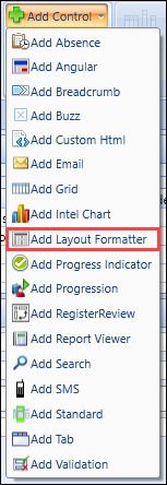
The layout formatter control is used to display label and field type data. To add a layout formatter control, select the Add Control button and select the Add Layout Formatter option on the System Configuration Commands ribbon.
A layout formatter can be used to display single or multiple rows of data, dependent on the data link assigned to the control.
You can enter the details of the layout formatter control in the Control Details section.
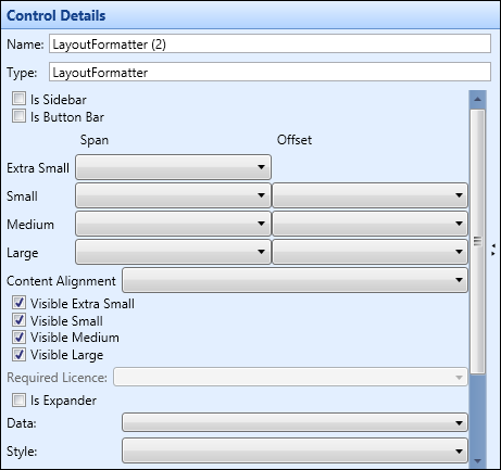
The fields for the layout formatter control are described in the following table.
| This field | Holds this information... |
|---|---|
| Name | The name of the control. |
| Type | The type of control. |
| Is Sidebar | Whether the control will display on the right-hand sidebar when the screen is small enough to display. This will be certain tablet sizes and smaller. |
| Is Button Bar | Whether this is a control that will contain buttons. |
| Span and Offset |
Where the control sits on the different screen sizes. Select from one to twelve for span and one to eleven for offset. Important.There is no offset for Extra Small as there is no space to use.
|
| Content Alignment |
How the content is aligned on the screen. Select from:
|
| Visible Extra Small | Whether the control will display when viewed on an extra small phone. |
| Visible Small | Whether the control will display when viewed on a phone. |
| Visible Medium | Whether the control will display when viewed on a tablet. |
| Visible Large | Whether the control will display when viewed on a PC. |
| Required Licence | This field is not applicable. |
| Is Expander |
Whether the control can be expanded. This is displayed with an expander button.
|
| Data | A selection of data links or control to associate the current control with. This enables you to add columns to the control from a data link. |
| Style | The CSS style to be used for this control. |
| HTML Classes |
The HTML classes to use so you can apply your own CSS styles to elements and display an institution-specific theme. Important.Multiple styles can be applied by adding a space between them (for example: alignleft smallfont).
|
| Hide if the contents are empty | Whether the element will be hidden if there is no data to display and therefore not affect the layout of the screen. |
| Hide if the associated COUNT data link returns zero (0) | Whether the element will be hidden if the associated data link returns a count of zero and therefore not affect the layout of the screen. |
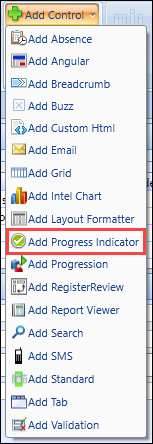
The progress indicator control is used to add progress indicators to pages and show progress in a configurable visual way. The control is data-driven, so can have any number of progress steps. To add a breadcrumb control, select the Add Control button and select the Add Progress Indicator option on the System Configuration Commands ribbon.
You can enter the details of the progress indicator control in the Control Details section.
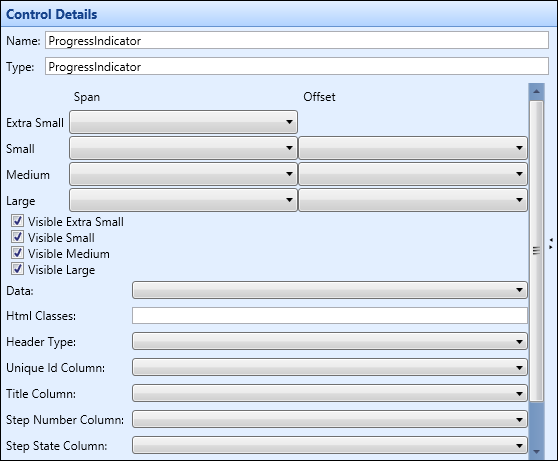
The fields for the progress indicator control are described in the following table.
| This field | Holds this information... |
|---|---|
| Name | The name of the control. |
| Type | The type of control. |
| Span and Offset |
Where the control sits on the different screen sizes. Select from one to twelve for span and one to eleven for offset. Important.There is no offset for Extra Small as there is no space to use.
|
| Visible Extra Small | Whether the control will display when viewed on an extra small phone. |
| Visible Small | Whether the control will display when viewed on a phone. |
| Visible Medium | Whether the control will display when viewed on a tablet. |
| Visible Large | Whether the control will display when viewed on a PC. |
| Data | A selection of data links or control to associate the current control with. This enables you to add columns to the control from a data link. |
| HTML Classes |
The HTML classes to use so you can apply your own CSS styles to elements and display an institution-specific theme. Important.Multiple styles can be applied by adding a space between them (for example: alignleft smallfont).
|
| Header Type | The header type for this control. |
| Unique Id Column |
The unique ID column for this control. Important.The data link associated with this control should return a single row per step. To group the steps together, ensure that each row is given the same unique ID (for example: for progress for an application, this might be the application ID. If more than one unique ID is returned, then multiple progress controls will be displayed.
|
| Title Column | The title column for this control (that is: the overall control title). |
| Step Number Column | The integer column giving the numerical order of the step on this control. |
| Step State Column |
The text code indicating the current progress state. The following are valid options:
|
| Step Title Column | The title shown above a single step (for example: 'Application Submitted') |
| Step Message Column | Optional additional text to show with the step (for example: 'Please book an interview slot'). |
When the required details have been entered and the changes saved, the progress indicators will be displayed on the page.

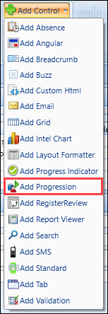
The progression control is used to progress learners. To add a progress control, select the Add Control button and select the Add Progression option on the System Configuration Commands ribbon.
You can enter the details of the progression control in the Control Details section.
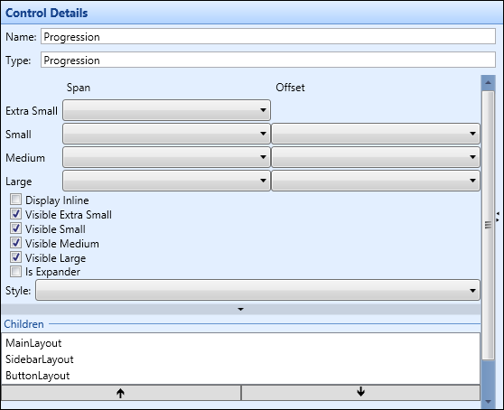
The fields for the progression control are described in the following table.
| This field | Holds this information... |
|---|---|
| Name | The name of the control. |
| Type | The type of control. |
| Span and Offset |
Where the control sits on the different screen sizes. Select from one to twelve for span and one to eleven for offset. Important.There is no offset for Extra small as there is no space to use.
|
| Display Inline | Sets whether all the columns for the control are next to each other. |
| Visible Extra Small | Whether the control will display when viewed on an extra small phone. |
| Visible Small | Whether the control will display when viewed on a phone. |
| Visible Medium | Whether the control will display when viewed on a tablet. |
| Visible Large | Whether the control will display when viewed on a PC. |
| Is Expander |
Whether the control can be expanded. This is displayed with an expander button.
|
| Style | The CSS style to be used for this control. |
| Children | The child controls attached to the tab control. |
| Sequence Number | The sequence this column occupies in a cell (column and row) if more than one control is specified for this column and row value. |
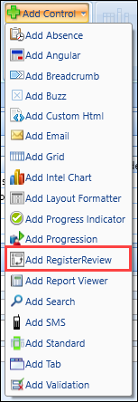
Register summaries can be viewed on the LearnerRegisters page. This page consists primarily of a register review control and an associated data link. To add a register review control, select the Add Control button and select the Add Register Review option on the System Configuration Commands ribbon.
The register review control is designed to display a configurable set of columns on the left-hand side of the control and then the slot information for the learner on the right-hand side of the control. Data columns can be configured onto the left-hand side of the control. The slot information displayed on the right-hand side of the control is fixed and based on the data link query assigned to the control. The data link query that provides data for the control must provide a row for each row to be displayed, multiplied by the number of slots displayed in the right-hand side of the control.
You can enter the details of the register review control in the Control Details section.
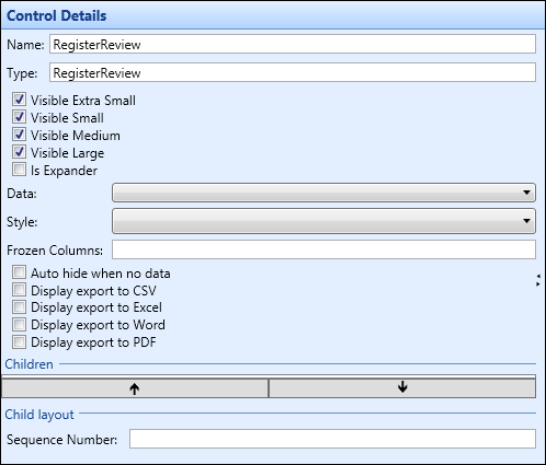
The fields for the register review control are described in the following table.
| This field | Holds this information... |
|---|---|
| Name | The name of the control. |
| Type | The type of control. |
| Visible Extra Small | Whether the control will display when viewed on an extra small phone. |
| Visible Small | Whether the control will display when viewed on a phone. |
| Visible Medium | Whether the control will display when viewed on a tablet. |
| Visible Large | Whether the control will display when viewed on a PC. |
| Is Expander |
Whether the control can be expanded. This is displayed with an expander button.
|
| Data | A selection of data links or control to associate the current control with. This enables you to add columns to the control from a data link. |
| Style | The CSS style to be used for this control. |
| Frozen Columns | Which columns on the register review are frozen when scrolling from left to right on a grid. |
| Auto hide when no data | If set, no grid will display if no data has been returned from a search. |
| Display Export to CSV | Whether the option to export to CSV displays on the page of the register. |
| Display Export to Excel | Whether the option to export to Excel displays on the page of the register. |
| Display Export to Word | Whether the option to export to Word displays on the page of the register. |
| Display Export to PDF | Whether the option to export to PDF displays on the page of the register. |
| Children | The associated columns for the controls. |
| Sequence Number | The sequence this column occupies in a cell (column and row) if more than one control is specified for this column and row value. |
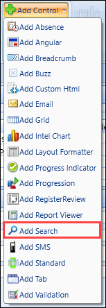
The search control is used to add a search to a page. To add a search control, select the Add Control button and select the Add Search option on the System Configuration Commands ribbon.
You can enter the details of the search control in the Control Details section.
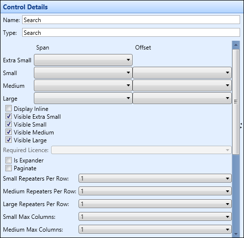
The fields for the search control are described in the following table.
| This field | Holds this information... |
|---|---|
| Name | The name of the control. |
| Type | The type of control. |
| Span and Offset |
Where the control sits on the different screen sizes. Select from one to twelve for span and one to eleven for offset. Important.There is no offset for Extra Small as there is no space to use.
|
| Display Inline | Sets whether all the columns for the control are next to each other. |
| Visible Extra Small | Whether the control will display when viewed on an extra small phone. |
| Visible Small | Whether the control will display when viewed on a phone. |
| Visible Medium | Whether the control will display when viewed on a tablet. |
| Visible Large | Whether the control will display when viewed on a PC. |
| Required Licence |
This field is not applicable. |
| Is Expander |
Whether the control can be expanded. This is displayed with an expander button.
|
| Paginate | Use to add a pagination control to allow multiple records to be displayed in a standard (for example: first/previous and next/last buttons, where you could show three records, but only see one at a time and navigate backwards and forwards between all three). |
| Pagination Header |
The header text in the pagination control. Important.This field only displays when the Paginate check box has been selected.
|
| Small Repeaters Per Row | The number of records to display per row on a phone when a standard is linked to a data link that returns more than one record (that is: this setting applies to each record in the standard, whereas the main settings control the layout of the whole control). |
| Medium Repeaters Per Row | The number of records to display per row on a tablet when a standard is linked to a data link that returns more than one record (that is: this setting applies to each record in the standard, whereas the main settings control the layout of the whole control). |
| Large Repeaters Per Row | The number of records to display per row on a PC when a standard is linked to a data link that returns more than one record (that is: this setting applies to each record in the standard, whereas the main settings control the layout of the whole control). |
| Small Max Columns | The maximum number of columns to display on a phone when a standard is linked to a data link that returns more than one record (that is: this setting applies to each record in the standard, whereas the main settings control the layout of the whole control). |
| Medium Max Columns | The maximum number of columns to display on a tablet when a standard is linked to a data link that returns more than one record (that is: this setting applies to each record in the standard, whereas the main settings control the layout of the whole control). |
| Large Max Columns | The maximum number of columns to display on a PC when a standard is linked to a data link that returns more than one record (that is: this setting applies to each record in the standard, whereas the main settings control the layout of the whole control). |
| Style | The CSS style to be used for this control. |
| Display Text | The text that displays on the button used to search. |
| Navigate to | The screen name the results of the search will be passed on to. |
| Hint Text | Text that displays in the tool tip when hovering over the search button. |
| Allow Blank Search | Whether you can search with no data added to any of the columns. |
| Tab Header | The title of the tab header. |
| Children | The associated columns for the controls. |
| Sequence Number | The sequence this column occupies in a cell (column and row) if more than one control is specified for this column and row value. |
The SMS control can be configured to send SMS messages to a single user or a group of users (that is: learners or members of staff/anyone with a person code). To add a SMS control, select the Add Control button and select the Add SMS option on the System Configuration Commands ribbon.
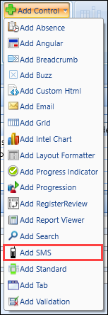
You can enter the details of the SMS control in the Control Details section.
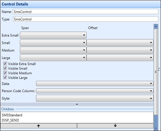
The fields for the SMS control are described in the following table.
| This field | Holds this information... |
|---|---|
| Name | The name of the control. |
| Type | The type of control. |
| Span and Offset |
Where the control sits on the different screen sizes. Select from one to twelve for span and one to eleven for offset. Important.There is no offset for Extra Small as there is no space to use.
|
| Visible Extra Small | Whether the control will display when viewed on an extra small phone. |
| Visible Small | Whether the control will display when viewed on a phone. |
| Visible Medium | Whether the control will display when viewed on a tablet. |
| Visible Large | Whether the control will display when viewed on a PC. |
| Data |
A selection of data links or control to associate the current control with. This enables you to add columns to the control from a data link. When configuring for a single learner, set to an appropriate data link containing the mobile phone number and person code. When wanting to send SMS messages to a number of learners, set to a grid control. |
| Is Selected Column |
Set this field to ensure that SMS messages are only sent to learners in the grid where the Boolean column is ticked. Important.This field is only displayed when a grid control is selected in the Data field.
|
| Person Code Column | The person code column for this control, which should be set to PERSON_CODE. |
| Style | The CSS style to be used for this control. |
| Children | The associated columns for the controls. |
| Sequence Number | The sequence this column occupies in a cell (column and row) if more than one control is specified for this column and row value. |
Adding a SMS control will also create a number of standard controls that allow you to configure various aspects of the design.
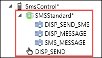
The SMSStandard contains the minimum necessary populated fields to send an SMS. All fields can be pre-populated on page load, either from static or dynamic text from a data link (for example: SMS text might be pre-populated as 'Hi Michael'). The following can also be configured:
- DISP_SEND_SMS - the control title which can be static or driven from a data link
- DISP_MESSAGE and SMS_MESSAGE - the SMS message and label
-
DISP_SEND - the send button text which can be configured
Important.The Lockdown column on this control can be used to determine whether or not the button is enabled (for example: disable if the learner does not have a mobile phone number, or has asked not to be contacted by SMS).
When the required details have been entered and the changes saved, the Send SMS section will be displayed on the page so you can send SMS messages to learners.

The standard control enables you to add data that will display on a page (that is: this data is generated from data links that have been added to the page and can be selected from the Data drop-down field). To add a grid control, select the Add Control button and select the Add Standard option on the System Configuration Commands ribbon.

You can enter the details of the standard control in the Control Details section.
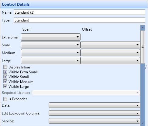
The fields for the standard control are described in the following table.
| This field | Holds this information... |
|---|---|
| Name | The name of the control. |
| Type | The type of control. |
| Span and Offset |
Where the control sits on the different screen sizes. Select from one to twelve for span and one to eleven for offset. Important.There is no offset for Extra Small as there is no space to use.
|
| Display Inline | Sets whether all the columns for the control are next to each other. |
| Visible Extra Small | Whether the control will display when viewed on an extra small phone. |
| Visible Small | Whether the control will display when viewed on a phone. |
| Visible Medium | Whether the control will display when viewed on a tablet. |
| Visible Large | Whether the control will display when viewed on a PC. |
| Required Licence |
This field is not applicable. |
| Is Expander |
Whether the control can be expanded. This is displayed with an expander button.
|
| Data | A selection of data links or control to associate the current control with. This enables you to add columns to the control from a data link. |
| Edit Lockdown Column |
The column to restrict editable access to data for (that is: control the editing of data to appropriate users). Important.This field is populated by the columns available in the data link specified in the Data field that are prefixed by 'ISEDITABLE_'.
|
| Service |
The REST service to use for configurable write-back. Important.This field is controlled by the OntrackWriteback licence. If the licence is not enabled, the Service field is greyed out.
|
| Flow Description Column | Not applicable for standard controls. |
| Paginate | Not applicable for standard controls. |
| Small Repeaters Per Row | Whether the row will repeat on a small screen. Defaults to one but when more than one has been set then the value will repeat that many times, dependant on the data link. |
| Medium Repeaters Per Row | Whether the row will repeat on a medium screen. Defaults to one but when more than one has been set then the value will repeat that many times, dependant on the data link. |
| Large Repeaters Per Row | Whether the row will repeat on a large screen. Defaults to one but when more than one has been set then the value will repeat that many times, dependant on the data link. |
| Small Max Columns | The maximum amount of repeated columns you want on a small screen. |
| Medium Max Columns | The maximum amount of repeated columns you want on a medium screen. |
| Large Max Columns | The maximum amount of repeated columns you want on a large screen. |
| Style | The CSS style to be used for this control. |
There is a further section under these fields that displays the column details.

The fields for column details are described in the following table.
| This field | Holds this information... |
|---|---|
| Children | The names of the columns associated with the control. |
| Sequence Number | The sequence this column occupies in a cell (column and row) if more than one control is specified for this column and row value. |
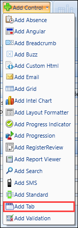
The Tab control is used to display different controls on a series of tabs (for example: a Tab control is used on the default Homepage in order to display different search controls on different tabs). To add a tab control, select the Add Control button and select the Add Tab option on the System Configuration Commands ribbon.
Tab controls are designed to be used in conjunction with data formatters. The tab control is configured in the required position on the page and then data formatters are used to provide the actual tabs. Each separate data formatter that is a child control of the tab control will be displayed as a separate tab.
You can enter the details of the tab control in the Control Details section.
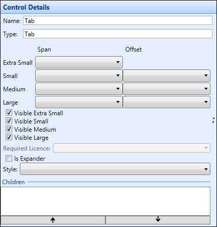
The fields for the tab control are described in the following table.
| This field | Holds this information... |
|---|---|
| Name | The name of the control. |
| Type | The type of control. |
| Span and Offset |
Where the control sits on the different screen sizes. Select from one to twelve for span and one to eleven for offset. Important.There is no offset for Extra small as there is no space to use.
|
| Visible Extra Small | Whether the control will display when viewed on an extra small phone. |
| Visible Small | Whether the control will display when viewed on a phone. |
| Visible Medium | Whether the control will display when viewed on a tablet. |
| Visible Large | Whether the control will display when viewed on a PC. |
| Required Licence | This field is not applicable. |
| Is Expander |
Whether the control can be expanded. This is displayed with an expander button.
|
| Style | The CSS style to be used for this control. |
| Children | The child controls attached to the tab control. |
A number of data formatters can be added to the tab control. Each data formatter will comprise a different tab on the tab control.
To add a data formatter to a tab:
-
Select the required tab control.
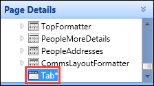
-
Select the Add Control button and select the Add Layout Formatter button on the System Configuration Commands ribbon.

The layout formatter control will display as a child control for the tab control.
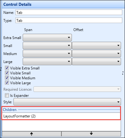
- Enter the details for the layout formatter.
-
Select Save .
The layout formatter is added to the tab control.
The validation control is used to display warning and error messages on a page. This would form part of a layout formatter control. To add a validation control, select the Add Control button and select the Add Validation option on the System Configuration Commands ribbon.
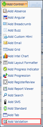
You can enter the details of the validation control in the Control Details section.
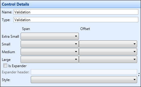
The fields for the validation control are described in the following table.
| This field | Holds this information... |
|---|---|
| Name | The name of the control. |
| Type | The type of control. |
| Span and Offset |
Where the control sits on the different screen sizes. Select from one to twelve for span and one to eleven for offset. Important.There is no offset for Extra Small as there is no space to use.
|
| Is Expander |
Whether the control can be expanded. This is displayed with an expander button.
|
| Expander Header | The header to display if the control is configured as an expandable section. |
| Style | The CSS style to be used for this control. |
To delete a control from a page:
-
Select the control you want to delete from the Page Details section of the screen, and then select the Delete Control button on the System Configuration Commands ribbon.

The Delete Control message is displayed.

-
Select OK to confirm the deletion.
The control is deleted from the page.
